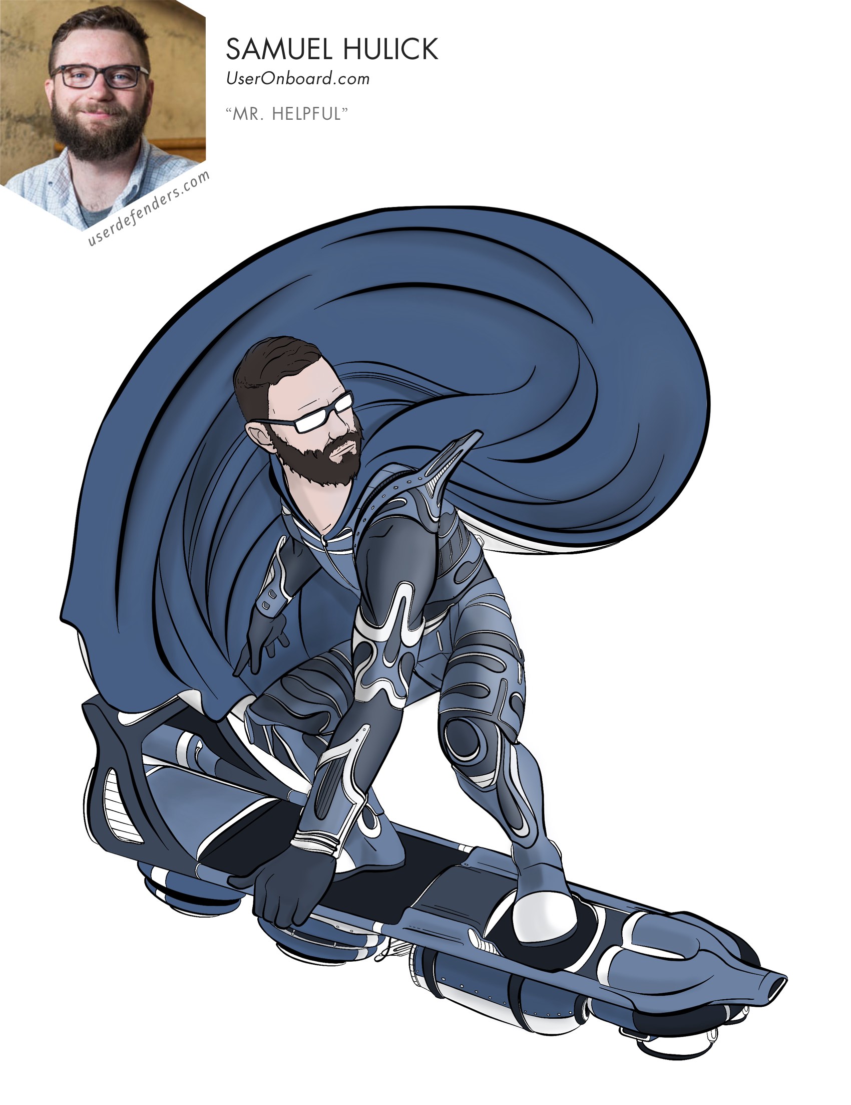

Samuel Hulick shows us how to build bridges for our users. He motivates us to make sure that the effort put into building the software is not wasted in the onboarding experience. He also inspires us to stay curious, and always be learning.
Samuel Hulick is the man behind UserOnboard.com where he creates popular teardowns of onboarding user flows on some of the most popular digital products around. He’s also an author of a book he’s definitely the authority on called “The Elements of User Onboarding”. He’s a consultant, UX designer and front-end developer based out of beautiful Portland, Oregon. He’s also a prolific writer publishing some pretty viral posts on Medium these days. You might be surprised to learn that Samuel is a high-school drop out.
- Secret Identity/Origin Story (5:04)
- Onboarding Defined (9:30)
- Biggest Superhero (16:08)
- Biggest Failure (17:00)
- Weirdest Teardown (32:00)
- Design Superpower (39:20)
- Design Kryptonite (41:24)
- Design Superhero Name (42:40)
- Habit Of Success (48:30)
- Invincible Resource (50:23)
- How Much Is Too Much (52:00)
- Best Advice (64:20)
LINKS
Samuel’s Personal Twitter
Samuel’s Professional Twitter
Samuel’s Website
Product People, Mind the Gap! [ARTICLE]
Never Mix Up Features with Benefits Ever Again [ARTICLE]
The Art of Building (or Burning) Product Bridges [ARTICLE]
Kathy Sierra (Business of Software 2009) [VIDEO]
Extra Credits (YouTube) [VIDEO]
BROUGHT TO YOU BY
Adobe XD
Design at the speed of thought with Adobe XD, the first all-in-one UX/UI solution for designing, sharing and prototyping experiences. Try the free beta today.
RealtimeBoard
Whiteboard. Finally in your browser. The simplest visual collaboration platform for agile product teams, UX/UI designers, project leaders, marketers and creatives. Try it free!
SUBSCRIBE TO AUTOMATICALLY RECEIVE NEW EPISODES
Apple Podcasts | Spotify | Pandora | Amazon Music | RSS Feed
USE YOUR SUPERPOWER OF SUPPORT
Here’s your chance to use your superpower of support. Don’t rely on telepathy alone! If you’re enjoying the show, would you take two minutes and leave a rating and review on Apple Podcasts? I’d also be willing to remove my cloak of invisibility from your inbox if you’d subscribe to the newsletter for superguest announcements and more, occasionally.
TAKEAWAYS
Design is about people. As designers we need to filter out the truth, and challenge our own assumptions as well, in our effort to avoid the status quo. But the hard work doesn’t stop at the completion of your design. There is a bridge that users need to be led across to help them see how your product matters. If we resist making something for the sake of making something, and focus on making the bridge easy to navigate–your users will fully realize all that your product has to offer.
SECRET IDENTITY/ORIGIN STORY
I was really interested in the World Wide Web when it started to become more mainstream in the 90s and found it compelling that you could create the media for it on your own. In an amateur and non-professional capacity, I became the person who knew how to make websites. I eventually jumped in as a professional about fifteen years ago and from there I knew websites were something that could positively impact people. When I was asked to code I would often be an advocate for the user and make recommendations that were frequently shot down so I decided to educate myself as much as possible and transition to a role where my recommendations were taken more seriously as a User Experience Designer. And shortly after that I started to really become interested in the whole user onboarding aspect.
ONBOARDING DEFINED
Aligning ourselves along with the user succeeding is the name of the game as far as I’m concerned. The structures and division of labor in the software world tend to have product teams and marketing teams. The product teams, in part, have a continuous involvement with making the product better to feed the power users’ needs while the marketing teams have a finite goal in mind of enticing users to sign up for the product. Onboarding attempts to take marketing signups and turn them into the product team’s newest power users. It’s responsible for overseeing that this is happening and that the efforts of both departments are working together without having users fall between the cracks. It’s about increasing the likelihood that people are successful when trying to adopt your product. I got passionate about this because I would literally see users signing up and not make it a third of the way towards getting some vague hint of what the product truly had to offer.
BIGGEST SUPERHERO
Kathy Sierra
BIGGEST FAILURE
I would probably fault myself for not taking as many chances as I could have. I like to operate from an empirical and experiment driven design method so coming from the world of development there would be something like unit tests or CSS where I could always do that. I would like to approach it in a similar way from the design perspective. Not in a way that treats people like an ant farm but in a way that design can be used for good in a studious and scientific manner. So I wish I could have operated more where I could demonstratively point to things and say, “We thought something was going to work this way but then it didn’t.” I believe we should put ourselves on the line a bit more and stand by the predictions we’re making and ask if we’re becoming better designers. That’s something I wish I had done more, especially earlier in my career.
WEIRDEST TEARDOWN
For people that aren’t familiar, teardowns are a screen-by-screen slideshow with annotations that displays the activation process for a web app. I was looking at one of the PDFs I made for a company and thought posting something similar might be interesting to people. So I picked a random company that I had never worked with to replicate the idea and ended up choosing an accounting software company. After creating the teardown I posted it to a sharing website and the site really messed it up quite a bit. The aspect ratios were way off and it made it blurry too. I went to bed thinking I had totally wasted my time. Well, when I woke up the next morning there was an email from one of the founders of the company I had used in my post. My first thought was it was going to be a cease and desist order with a follow-up notification from a lawyer or at least something really bad. It turned out to be the exact opposite. He thanked me for the review of their onboarding experience and stated that they had already made some changes based on my recommendations. Then he asked if they could help promote my work by presenting it on their blog. I thought it was going to be one way and it totally turned out to be the other!
DESIGN SUPERPOWER
I care a lot about return on investment and not wasting effort so, for me, it’s about maximizing the outcome of my efforts and how much can I amplify the specific thing I’m trying to do. So caring about the outcome so it’s actually improving people’s lives is my superpower.
DESIGN KRYPTONITE
I try to resist the Silicon Valley narratives and instead try to keep things down to human scale. It’s very easy to tell ourselves stories and get wrapped up in the tale without questioning if it reflects reality or not. I constantly have to do reality checks to avoid being seduced into something that has little merit in the real world.
DESIGN SUPERHERO NAME
Mr. Helpful
HABIT OF SUCCESS
I’m always really excited to learn. You can go out and find a lot of gems in neighboring fields and apply them to the product you’re working on so I’d recommend to keep a habit of being curious and make use of commonalities that you discover as you explore.
HOW MUCH IS TOO MUCH
John Wooden used to say, “Never mistake activity for accomplishment.” I think it’s entirely possible to give people a ton of busy work and a ton of hoops to jump through but the onboarding is never really done until the person using the product is better at something, regardless of how complex your product is. Whenever possible, I like to identify what the real world situation is that someone is trying to get out of as well as what they’re trying to get into. How can we create affordances for that where they can make that transition as painlessly as possible without giving them a bunch of busy work in-between. Ideally we’re taking work off of their plate instead of adding additional work to their plate. I don’t know that I have a rule of thumb other than put it into people’s hands and see how they respond to it. If they respond in the wrong way then it is probably better to reduce things rather than adding more. It’s all about removing boundaries.
BEST ADVICE
I’m asked this question every so often and it’s not uncommon for people to say they haven’t received opportunities to get into the UX design side of things because their job won’t let them or they don’t have the experience. My answer to that is – neither did I. You need to take a DIY approach and look at the barriers that are preventing you from getting those opportunities you’re after and then take matters into your own hands. I think it’s a lot easier than people might believe and easier than people even in our own industry might lead you to believe. You really don’t have to learn the ins and outs of a contextual inquiry or a persona design or whatever, if all you really care about is making something better for humans.

