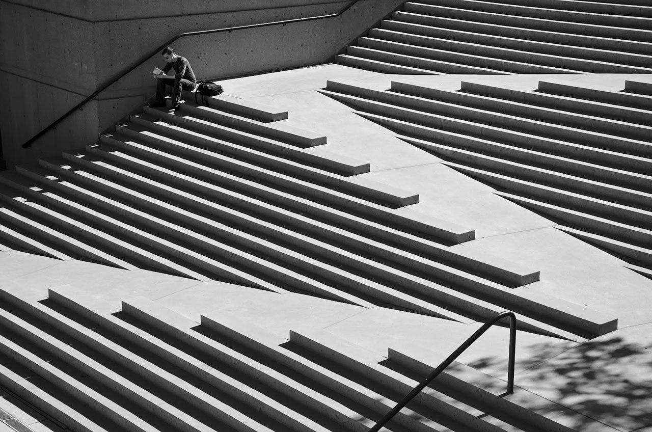
I still remember seeing my disabled father fall at a gas station.
Even though it was over 30 years ago, the traumatic “flash-bulb” memory is still (and forever will be) ingrained in my mind.
My husky, 6’3” father was taking a couple of steps back after filling up the tank, and had no way of seeing the short, concrete poles designed to protect the pumps from collision.
Watching this 220lb, man whom I love fall backwards, and suffer the pain that he did afterward, along with hearing my traumatized mother’s screams, covered every inch of my heart with hurt.
Every time I see those posts while filling up, I remember that awful night, and wonder how many others have fallen as a result of their existence.
Since those danged “gotcha poles” still exist, I’m assuming not enough people have been injured to instigate a redesign of this spurious convention.

The crazy thing, is this accident could’ve happened to anyone, not just someone with a leg handicap like my father.
Thankfully, there’ve been a lot of innovative design solutions implemented for accessibility throughout the years, in both the physical and now digital world.
In the physical world, I think of curb-cuts, ramps, audible pedestrian signals, braille in the marketplace, even the easy-to-miss check writing surface for the wheelchair-bound in grocery stores.
The other epiphany I had was that although I’m not officially disabled right now, chances are, I will be in the future as a helpless victim of the aging process (thanks Adam & Eve), and possibly (but hopefully not), through an unavoidable accident.
Although I can see, and walk just fine (er, actually that’s debatable at present since my recent slip on the ice), I currently have a myriad of disabilities that I just don’t talk about openly (ask me and I’ll tell you).
If you’re not already disabled in some ways, I’m sorry to tell you that eventually, more than likely…you will be.
In fact, Nielsen Norman Group has research proving the undefiable laws of human entropy, and degeneration in the context of navigating the web stating:
“Between the ages of 25 and 60, the time users need to complete website tasks increases by 0.8% per year.”
If you’ve ever had the great privilege of hearing my latest User Defenders: Podcast superguest Derek Featherstone speak live at a conference like An Event Apart, you’ll recall that he always does “the straw test”.
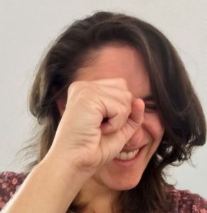
Meaning, he will ask the audience to make a fist, and try to see and mentally navigate a website experience on the screens through the tiny hole created with your fist.
Talk about instant empathy for those quite probable high percentage of visually impaired users of ours!
All great design roads lead back to empathy…always.
Although there’s some who may argue that the framing of this theme of “temporarily-abled” which my friend Jennifer Aldrich did an incredible job articulating in her UX Mag article is negative, and insensitive.
I’d have to respectfully disagree.
The reality is, all of us by nature are inherently selfish beings.
I’ll prove it to you.
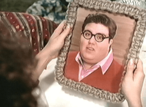
When someone shows you a group picture that you’re in, who do you look for first?
Exactly! YOU! 🙂 I do it too.
If it takes realizing we’re all going to be disabled eventually, to put ourselves in the currently disabled’s shoes, then it’s better than just continuing to put [ahem] blinders on to the real needs that exist in the world beyond our little, comfortable, temporarily abled bubbles.
When we design for the world we want to live in right now, we’re helping the folks who may not be able to do the same things we can now, and intrinsically, our future selves later who won’t be able to do the same things the disabled can’t do right now, too.
Small changes now, make a big difference later (and especially now).
I know we don’t all have the affordance to be in the same room as folks with disabilities, but I would encourage all of us designers, to as often as possible be in the same room, and look for opportunities to make it happen.
The biggest takeaway I got from Derek in our time together, was to start small with designing for accessibility and inclusivity.
Here it is from the “Feather’s” mouth:
“I can tell you tons of stories, but until people get out there and get outside their normal routine of designing within their own heads, or designing for people that are just like them, until we get out and start actually talking with people with disabilities and incorporating them into our process, we’re not gonna have that much significant change.
So I think that’s one of the best ways forward for people is to take one thing about your design process, and figure out how to incorporate people with disabilities in it, whether that’s near the beginning, middle or end of the design process.
Anything that you do is more than what you’re doing right now. Take one more step and incorporate something new. Even if you do something new every two weeks, or every month, talk to one more person.
I think that will change everything.”
— Derek Featherstone
[simple-author-box]

